Part of a series on the basics of layout composition for an appealing UI. Colour is one of the most important elements of a design. Since vision is our most dominant sense, colour has an enormous impact on the feeling of a design. But it’s easy to overdo colour, so use it wisely! Here are some important facts about designing with colour.
When creating a design, choosing colours is one of the most important aesthetic decisions you will make, because it is one of the first things people will notice about it. You have the power to attract or repel users with your use of colour. (I hope you want to attract them, in which case, please read on!) Despite its importance, or maybe because of it, using colour well can be tricky.
My overarching advice is when in doubt, use less colour, not more. It is better to risk looking boring than repellent, and a well-executed monochromatic colour scheme can be very appealing, if subtle. Save pops of colour for where you really need it, like for buttons or warnings. Keep colours consistent throughout your system, unless there is a good reason to change them, in which case this should be obvious to the user with a minimum of explanation.
Colour does not add a pleasant quality to design—it reinforces it. -Pierre Bonnard
1. Perception
Colour doesn’t really exist, except in your head. What you experience as colour is in fact different wavelengths of light hitting the red, green, and blue receptors in your eye and being interpreted by your brain. The range of light we can see is called the visible spectrum. You know it as the colours of the rainbow: red, orange, yellow, green, blue, indigo, and violet. Other spectrums of light exist, like infrared and ultraviolet, but we can’t perceive these with our eyes.
We can also perceive black (the absence of all colour) and white (all the colours reflected into the eye at once). As humans, we depend more on our sight than a lot of other mammals, so our eyes have evolved to be very sensitive to colour. Some sources say we can see up to 10 million different gradations of colour.
At the most basic level, colours are divided into light and dark. Red is the next most easily distinguished colour, appearing even in languages that have only three colour words (i.e. light, dark, and red). Languages with four or five colour words will add either green or yellow, and languages with six will add blue.
2. Purpose
The main purposes of colour are to aid in recognition, draw attention, reinforce hierarchy, clarify meaning, and add interest to a design. In marketing, it’s said that the use of colour increases brand recognition by 80%.
Colour makes an object stand out, helping people to notice and remember it better. There should always be an obvious reason for it standing out otherwise users will wonder why. For example, on websites, the sign-up button is often a different colour, encouraging visitors to click on it. In a FileMaker solution, though, you might want to make all your action buttons the same colour, or co-ordinate their colours from a palette you develop.
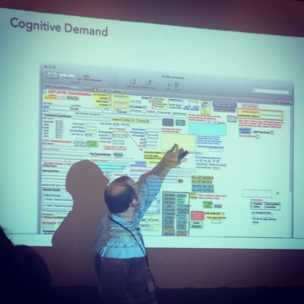
Too much colour can be distracting, as the elements start to compete with one another and the user becomes confused about what they are expected to pay attention to, or try to decipher what each colour means. Because our eyes are so sensitive, a small amount of colour can attract a lot of attention to itself, so it’s best to use colour sparingly.
3. Colour models
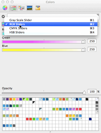
Backlit monitors like computers and smartphones work with the additive colour model (RGB). Red, green, and blue light rays are emitted from the screen. The various combinations of each of these colours produces the colours we see. It’s called the additive model because when you add all the colours together, they produce white. In FileMaker, we typically specify colours as RGB values, unless we’re producing printed reports where colour accuracy is important.
In contrast, the subtractive model is used to represent colour on paper (like the CMY(K) used in printers). Colours are created by mixing cyan, magenta, and yellow inks. Mixing them all together makes black (sort of, in reality printers add pure black—represented by the K in CMYK). You may be familiar with it as this is where the so-called primary colours red, yellow, and blue (RYB) come from. When we are developing colour palettes, we often use the subtractive model to determine pleasing combinations.
The main practical consideration between the additive and subtractive models is that in the additive model, light is sent directly into your eye, whereas in the subtractive model, light from the environment is reflected to your eye from the page. Because of this, reading from a screen is more tiring than reading on paper. Increasing readability to reduce fatigue is an important consideration because people can spend many hours a day looking at a FileMaker application on a computer screen. Among other things, this means keeping bright colours to a minimum.
4. Colour properties
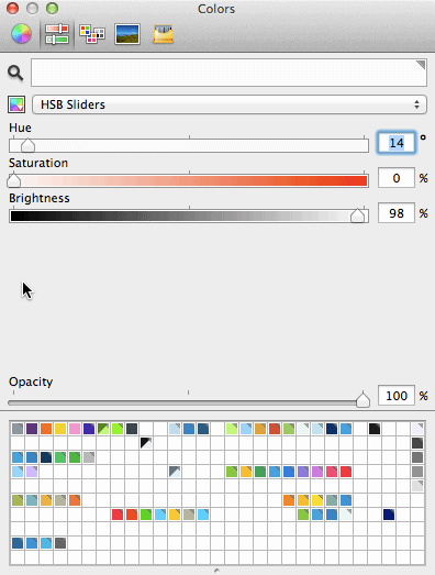
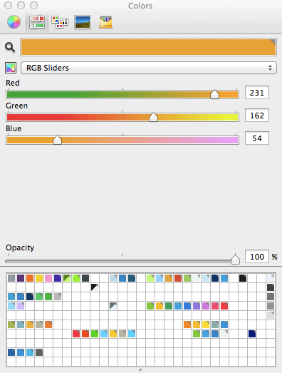
While colour interpretation happens in our brain, we can still describe the physical properties of any particular wavelength of light. One way is to describe its hue, saturation, and brightness values (known as HSB or sometimes as HSV). The HSB description is based on the additive RGB colour model. You’ll find HSB and RGB adjustment sliders in FileMaker’s colour palette. You can adjust the sliders to develop a range of colours you can use in your design.
Hue refers to the colour’s position (wavelength) on the visible spectrum. We tend to describe hue in terms of the colour’s name (blue, blue-green, red, red-orange, etc.). Saturation refers to the intensity of the colour, or its “chromaticity”; that is, how pure it is (the width of the light wave), or the amount of white added to it. As saturation decreases, colours seem paler or washed-out. As it increases, colours seem more vivid. Brightness refers to how much energy output is received from the source of light (the wave’s amplitude), or how much black is added to it, what we see as the lightness or darkness of a colour. People in general tend to be more attracted to bright colours.
5. Describing colour
In FileMaker, HSB is only one way we can pick colours, there are many options you can choose from. However, I find the HSB or RGB sliders to be the most convenient when I’m developing a colour palette. Although I personally don’t use the actual sliders much, I derive the HSB or RGB values from a sample and then I can dial them into my FileMaker colour palette.
Keep in mind that RGB calibration (which includes HSB) differs from device to device, so colours may look one way on your laptop, but different on someone else’s display. If you’re really concerned about this, then stick to the standard 216 web-safe colours, which are more reliable on different devices. In the majority of cases, it won’t matter too much, so don’t worry about it.
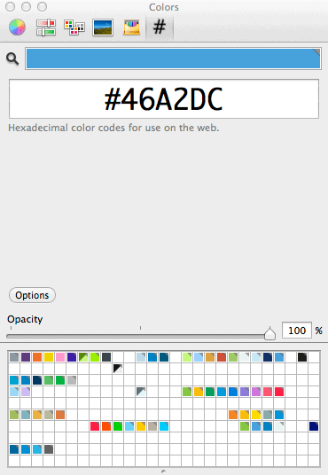
On the web, hexadecimal (“hex”) codes are commonly used to describe an RGB colour. The hex code is simply a way of specifically communicating a particular colour to the computer using a 6-digit code. Because FileMaker themes are written in HTML, they rely on CSS to describe their presentation properties, and so use hex codes to describe colour. You’ll need this if you plan on creating a custom theme. Right now you can’t specify hex codes directly in FileMaker’s colour picker, but it would be nice if you could, as they are fast becoming ubiquitous.
6. Colour sampling
FileMaker uses your operating system’s default colour palette. On the Mac, this means you can use the magnifying glass to hover over any item on the screen and sample its colour. In practice, if you want to sample an object that’s not in FileMaker (say, a photo), before you click on the magnifying glass you’ll have to go to FileMaker and then close or move any FileMaker windows out of the way first. Otherwise, as soon as you click on another program, FileMaker—and the colour palette along with it—are hidden.
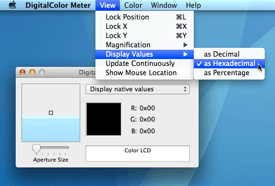
To get the hex code for any colour, I use Acorn, a Photoshop-like program that includes a colour picker that uses hex values. On the Mac, you can also use the Digital Color Meter program (found in “Utilities”) to find the RGB or hex values. (If you’re not on Mac, here are some other colour sampling tools for different platforms.)
Once you’ve sampled or dialed in the colour, you can drag and drop it into a colour swatch (one of the little boxes in the colour palette at the bottom). Because they derive from the OS, these swatches are local to your computer, and transfer across programs. So you can sample them in one program, and they’ll be available to you in FileMaker.
7. Colour theory
Colour theory is the study of how colours are perceived by people. In user interface design, the ideal is to create harmonious, pleasing colour combinations, because these attract the user and support learning and remembering.
Colour theory dates back to Leonardo da Vinci. The influential book, “Interaction of Color,” by Josef Albers, is based on the idea that human perceptions of colour change depending on the amount and proximity of other colours. It’s important to experience and experiment with different colour combinations in order to understand how to combine colours effectively. Also considering checking out the “Color Design Workbook” by AdamsMorioka and Terry Stone for a detailed discussion of colour in design.
One of the most widely used colour wheels is the 12 Step Colour Wheel, otherwise known as the Subtractive Artists’ Primary Colours (RYB) wheel. It shows the primary, secondary, and tertiary colours you may have learned in school.
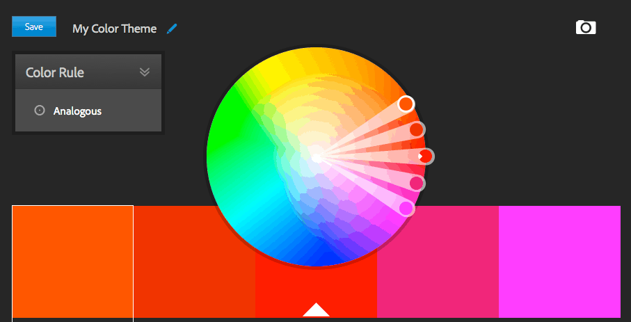
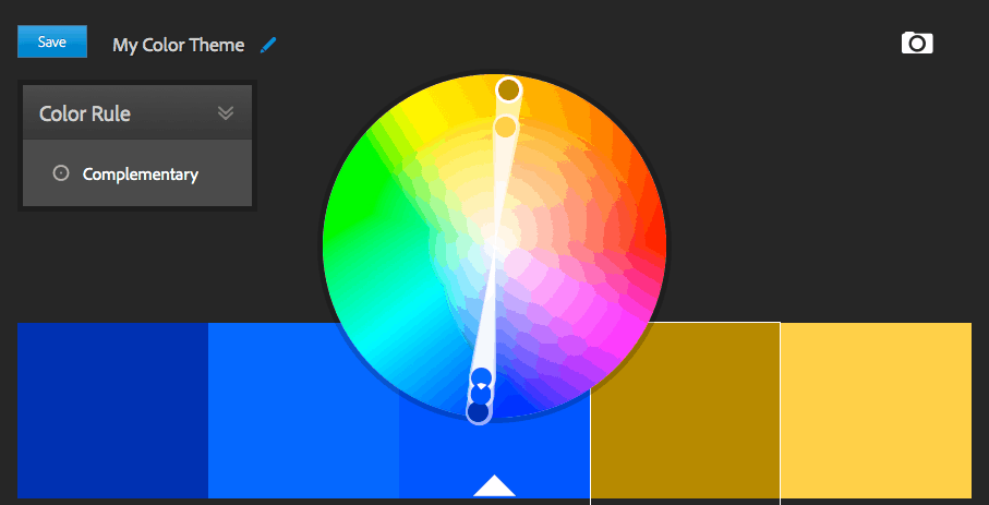
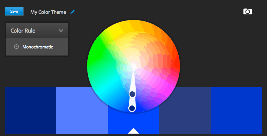
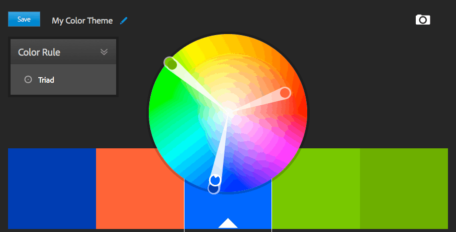
When choosing colours for a design, the goal is to create colour harmony. Here are some common types of harmonious colour combinations drawn from the colour wheel (screenshots from Adobe Color CC):
- Analogous – Colours that are next to each other on the colour wheel. They have similar wavelengths and so tend to go well together, as long as you choose colours with enough contrast. One colour will be a primary or secondary colour, and will tend to dominate the other two.

- Complementary – Two colours that are directly opposite on the colour wheel. These colour combinations are exciting as they have the most contrast possible. However, they can cause visual vibration and are not good for text, so be careful.

- Monochromatic – Shades and tints of a single colour (hue). This colour scheme has the least amount of contrast, and can be very subtle but effective.

- Triadic – Three colours evenly spaced around the colour wheel. This provides a fair amount of contrast. Choose the triad carefully, as the ones based on primary colours can be loud.

8. Choosing a colour palette
You don’t always need to choose a lot of colours. You may only really need to choose a background, base, and accent colour. When you are browsing around the web or using software on your computer, train yourself to notice what the colours are and how they are being used.
There are a number of websites that can help you create a coordinated colour palette:
- Adobe Color CC (formerly Kuler): Allows you to choose a type of colour scheme (analogous, complementary, etc), and then adjust the pointers to get something you like. You can also browse colour schemes created by others, as well as create a palette from an uploaded image.
- ColourLovers: Create a custom palette or explore palettes created by others.
- Paletton: Similar to Adobe Color CC, lets you choose a type of colour scheme and then generates various shades for the palette.
Sometimes colours are divided into warm and cool colours. Red, orange and yellow are called warm, and blue, green, and light purple are considered cool. They may be divided like this because red is at the edge of visible light, just below the infrared spectrum (a type of heat radiation not visible to our eyes), whereas objects at a distance tend to appear bluish.
Visually, warm colours tend to advance, while cool colours tend to recede. Keep this in mind when developing a palette, as one based on warm colours will stand out more, and one based on cool colours will blend in more.
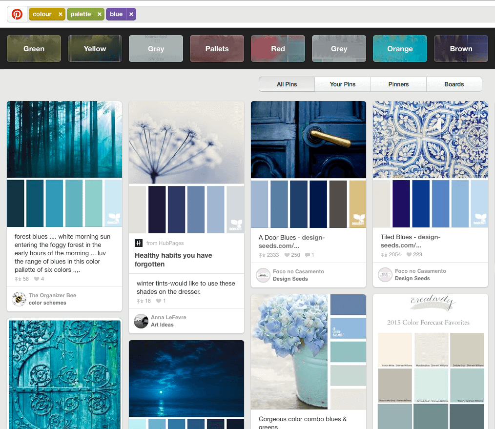
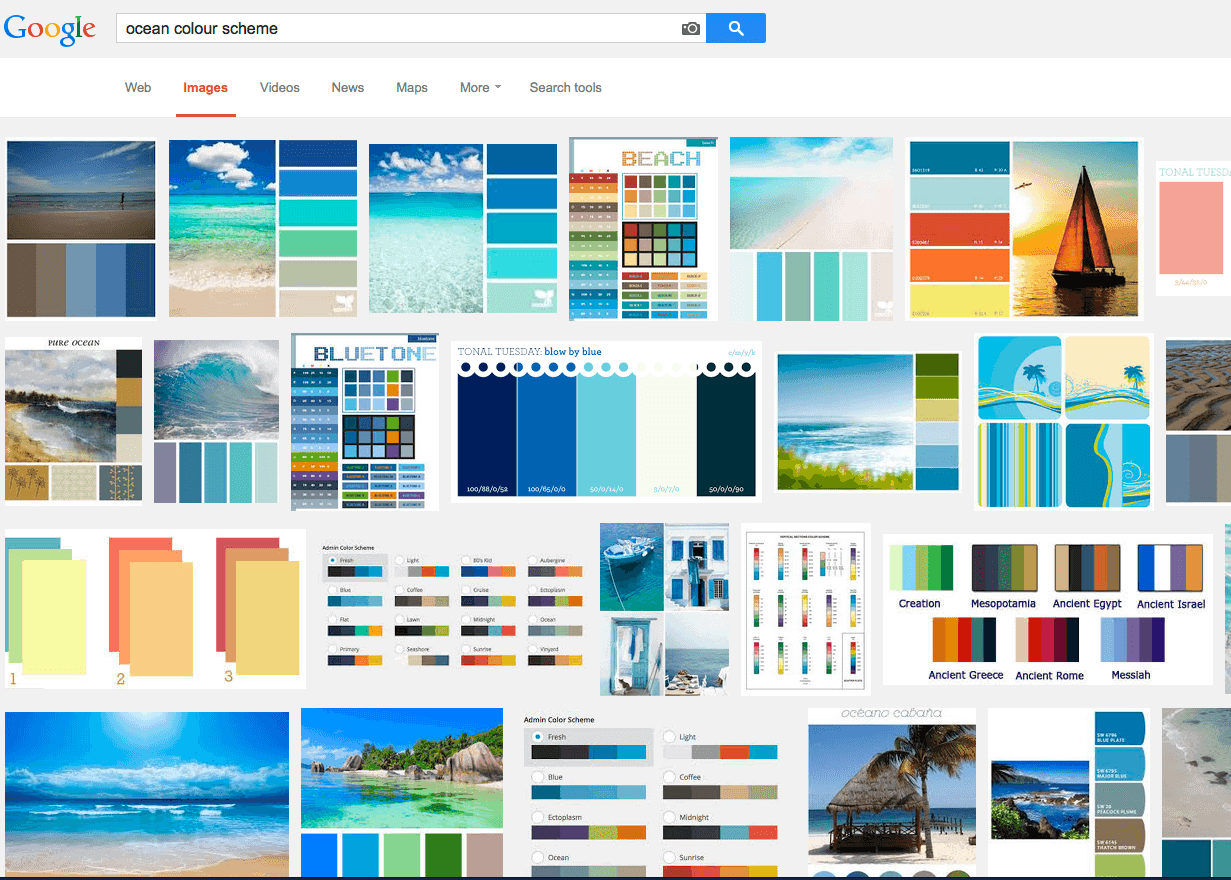
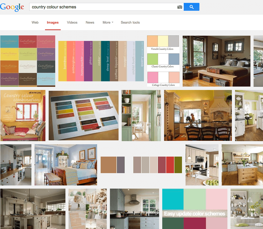
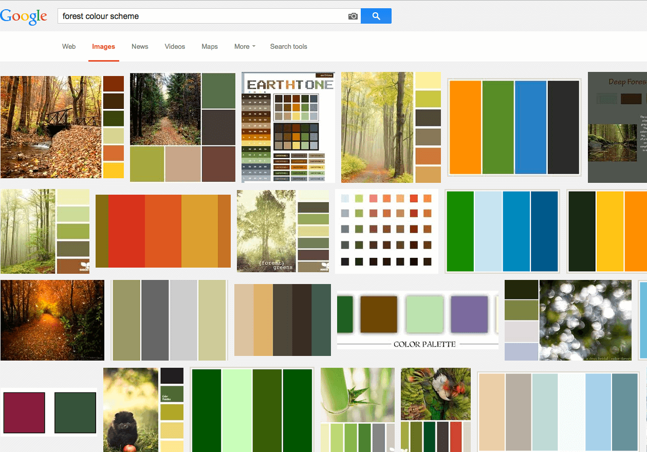
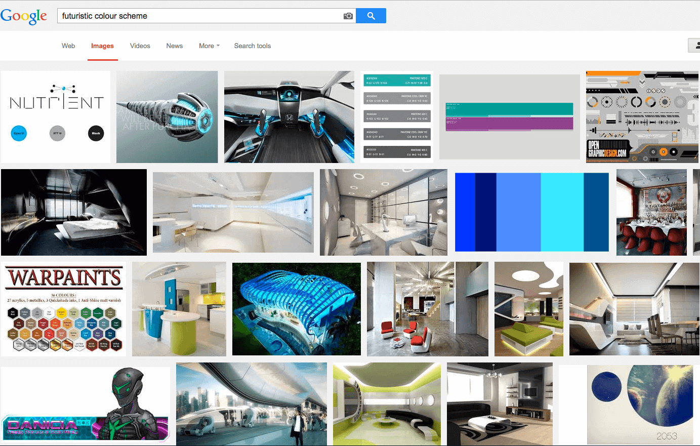
If you are developing a palette, try a Google image search or a Pinterest search for images or a pre-made colour palette that you can sample.
9. Colour meanings
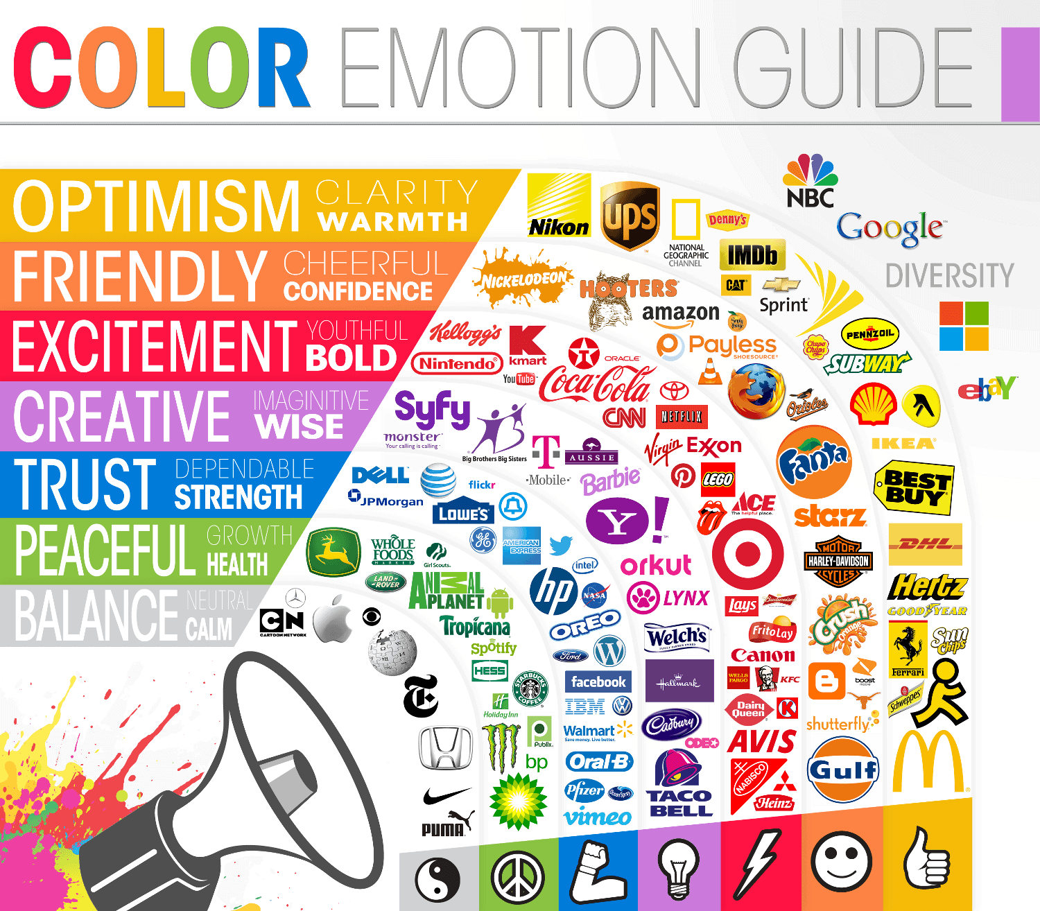
We ascribe meanings to colour (based on our gender, age, personal preferences, and cultural associations) and in turn seeing certain colours affects us psychologically. Teams that wear red uniforms actually win more often, for instance. Red is associated with fire and intensity, while blue is associated with the constancy of water and the sky. Bright colours convey energy and excitement, while soft pastels are calming.
There are many resources available to help you determine the broad associations with colour. The excellent site ColorMatters has loads of information on colour and its impact on our lives. See also David McCandless’ colour wheel for a visualization of how colour is perceived across cultures.
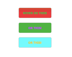
Avoid some colour combinations altogether. About 8% of men are red-green colour blind, the most common kind of colour blindness (women are less affected), so red-on-green or green-on-red are to be avoided. Also, it’s best to avoid putting a bright colour on top of another bright colour, as these are hard on the eyes and can make the colours appear to vibrate. Please don’t do the following:
10. Colour and style
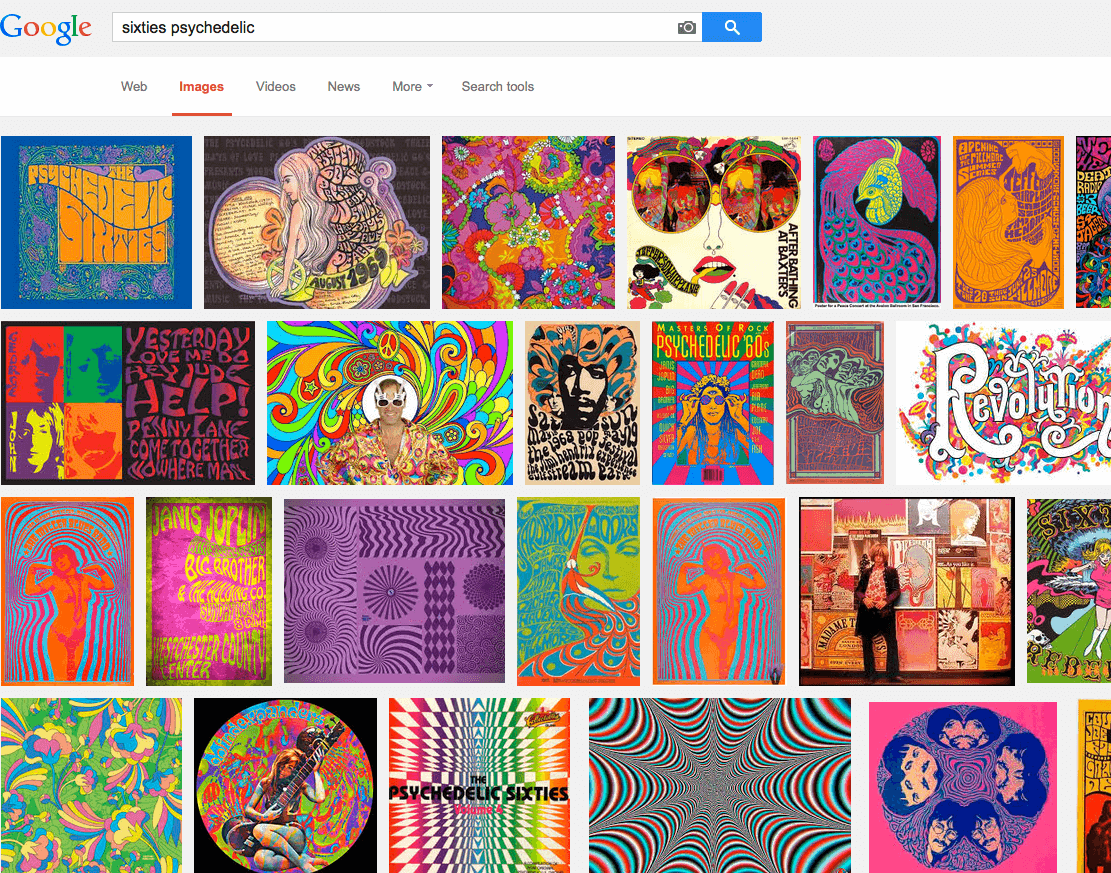
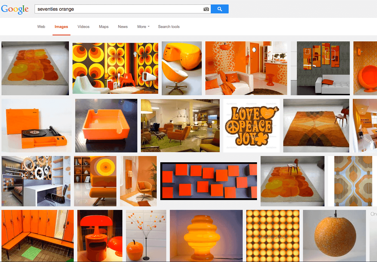
Colours should match the personality or emotion you’re trying to convey. Think of one or two dominant personality traits, physical attributes, or concepts you want to associate with your application (e.g. fun and energetic, or dependable and trustworthy), and then do a Google search for that term and see what colours you see most. A green, earthy palette will convey a different feeling than one using bright primary colours.
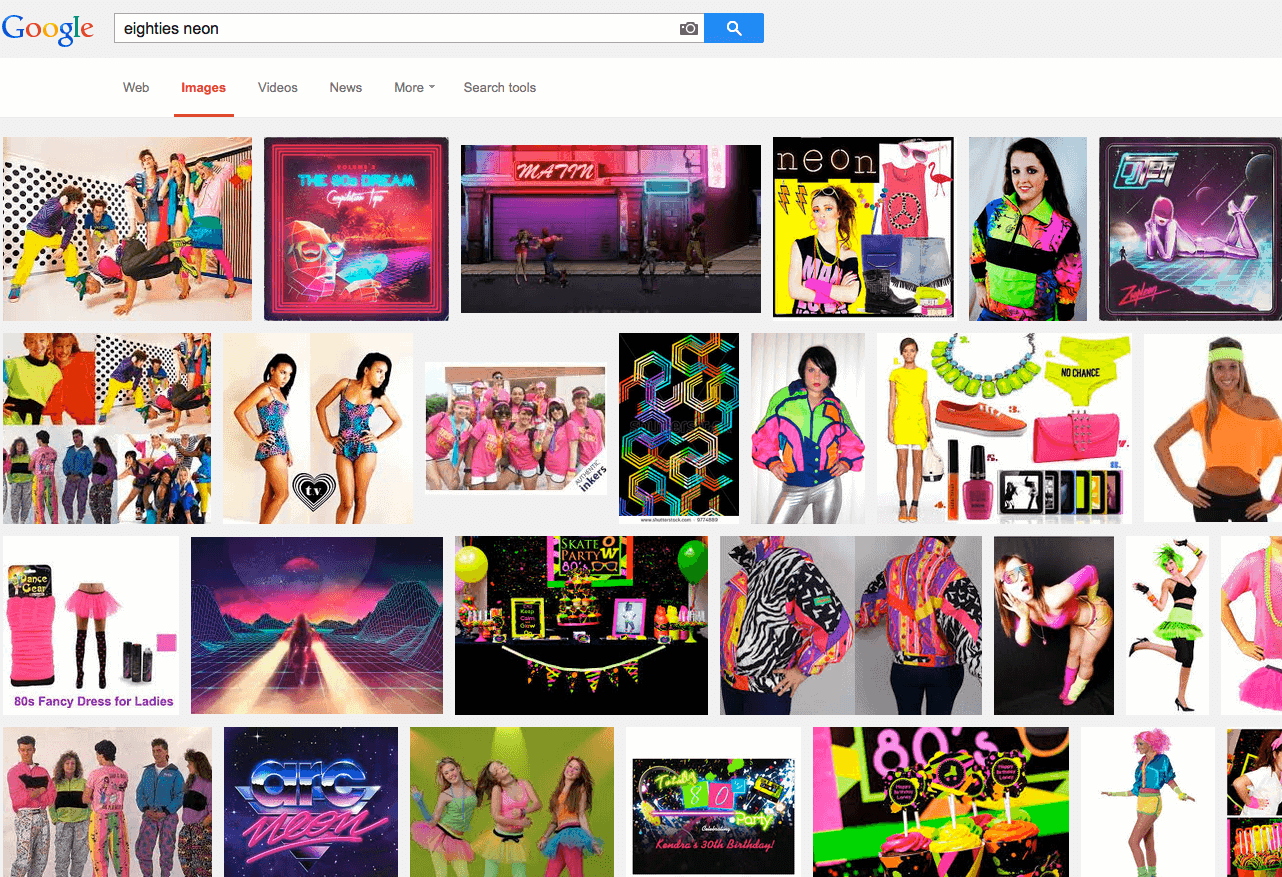
Colours can and do go in and out of fashion. While colour fashion over time might seem random, in fact the Pantone Color Institute sets colour trends for the coming year. Because colour and fashion go together, certain palettes can evoke nostalgia for specific decades.
Colour in application design is often influenced by current trends and popular apps and websites. For instance, right now flat design and bright colours are trendy. Or, perhaps you prefer retro colours instead? Just be careful about following trends too closely, otherwise your design risks looking dated quickly. And given the long life of many FileMaker systems, you may be looking at a once-trendy design for a long time to come.
Conclusion
Colour can dramatically affect the usability and effectiveness of a design. The purpose of colour is to set the mood, reinforce the hierarchy, and call attention to important elements. If you use too much colour, you risk creating a distracting, confusing design. Fortunately, a little colour goes a long way, so it doesn’t take a lot of colour to make a design more interesting without being overwhelming.
Do some research and see what colour combinations you are attracted to. Check out the way colour is handled in the applications you typically use, and see what you can copy and adapt to your own purposes. Ask yourself if they are using a monochromatic, analogous, or complementary colour scheme (or something else). What are the background, base, and accent colours? How much colour is being used, and for what purpose? Like anything, understanding how to use colour is a skill that improves over time.
How can your judicious use of colour support the user in your next design?




One of the concise, yet thorough, discussions of color and their impact on the work we do as software developers. Thank you (yet again!) for teaching and guiding us towards better design!
Jim
Thanks so much for reading!
Alexis
now it’s time to rethink my UIs. Great info thanks for sharing!
Great! Thank you very much. Also liked the PP3 handbook!