Determining and communicating a visual hierarchy is crucial to the effectiveness of UX design. If the visual hierarchy doesn’t exist or isn’t communicated clearly, your audience can get totally lost in or confused by your app. Read on to learn the principles of visual hierarchy, and how an effective visual hierarchy can help you create better UX design for custom apps.
Have you ever opened an app for the first time and been totally confused by what you see? Maybe you couldn’t figure out what to click on first, or you didn’t understand what the focus of the app should be, or you weren’t sure how the different elements of the app related to each other. You might have gotten frustrated and eventually given up, never to use that app again.
Well, most likely the app lacked a well-defined visual hierarchy. Without visible indicators, a UI can’t guide you to the most important elements first, or reliably convey the relationships between different parts of the interface. This makes an app hard to understand and navigate.
However, when you do have a clear visual hierarchy, you can guide the user’s eye to exactly where you want them to look, and take them step by step through the information contained in your app.
Understanding visual hierarchy
First, let’s define “hierarchy.” A hierarchy is the difference in levels of importance between groups of people or information.
You’re probably aware of hierarchy in the ranks of an army or navy. A book is an example of hierarchy applied to information: books are commonly divided into chapters, sections, paragraphs, and sentences, each contained inside the other.
Similarly, the information contained inside an app can be categorized into a hierarchy. For example:
- You need to have a customer before you can issue them an invoice.
- A project contains a set of related tasks.
- A calendar is divided into years, months, weeks, days, and hours.
You get the idea. The entity that comes first (or is more general), is by definition higher up in the hierarchy. Entities that come later, or are more specific, are lower down in the hierarchy. How you communicate these differences in level on your UI is known as the visual hierarchy.
What is visual hierarchy?
The visual hierarchy is a set of visual cues contained in a design that communicates the relative importance of different pieces of information.
You can use differences in size, colour, font style, and grouping as visual cues that indicate a change in level.
Why is visual hierarchy important in UX design?
A clear visual hierarchy is crucial to creating an effective user experience, since it helps people easily understand and navigate your app. It allows them to explore with confidence, and makes your app simpler to use.
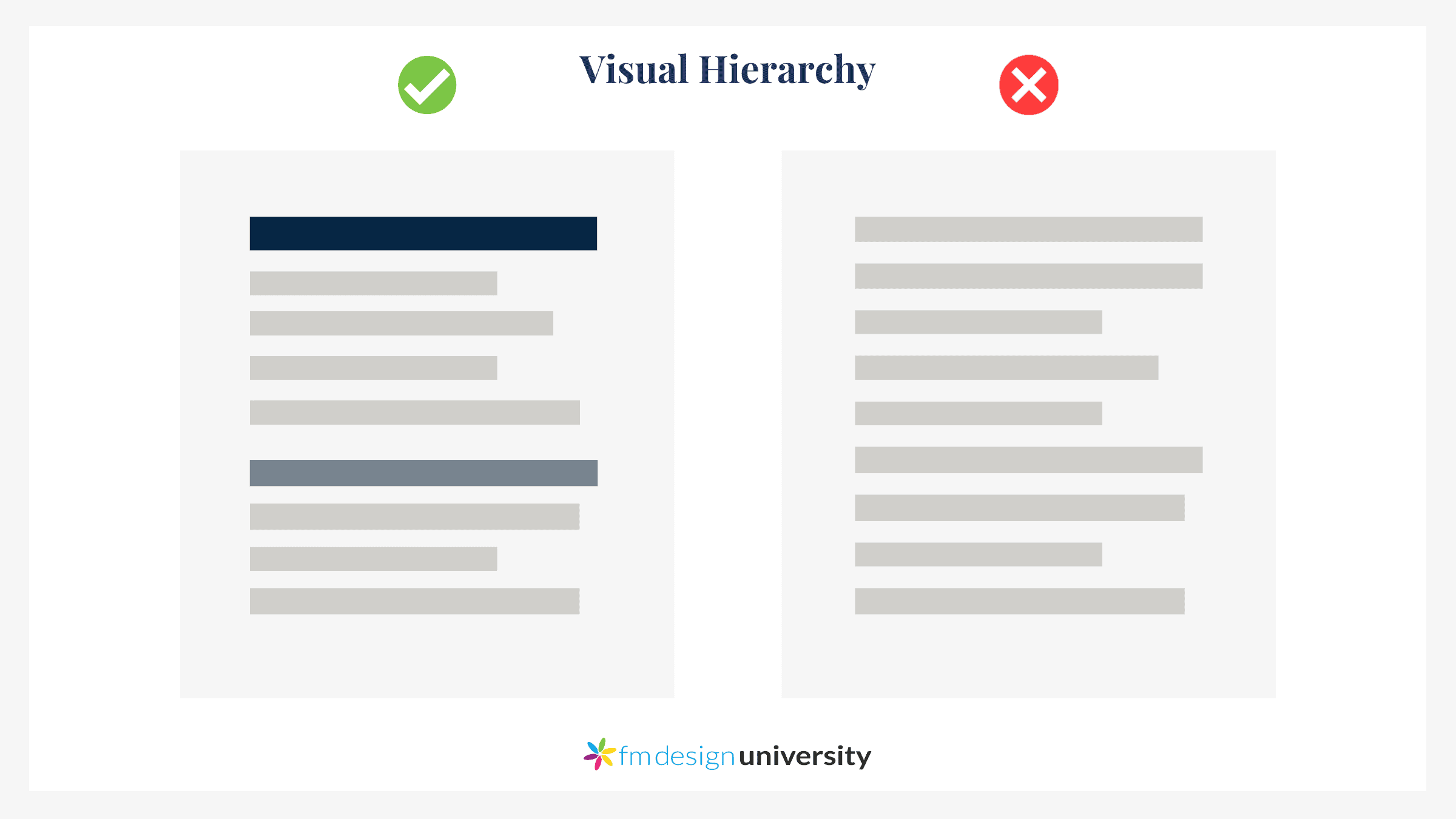
Here’s a comparison of good vs bad visual hierarchy:
In the example on the left, the page is divided into sections. The top section has a larger and darker heading, and the lower section has a smaller and lighter heading. The larger heading attracts more attention and thus seems more important, so most people will probably look at it first.
In the example on the right, there’s no visual differentiation. All the information appears to have the same importance, although in reality that’s unlikely. Without cues to guide us, we’ll have to start at the top and read through all the information until we get to the bottom. Only then will we be able to decide what information is most important.
As you can see, a lack of visual hierarchy can leave people wondering what to click on or read first, and can lead to a poor user experience.
On the other hand, a clear visual hierarchy helps people navigate through the information more easily. Understanding it quickly makes them feel successful. As a result, they’re more likely to describe your app as being “intuitive”.
Some examples of good visual hierarchy
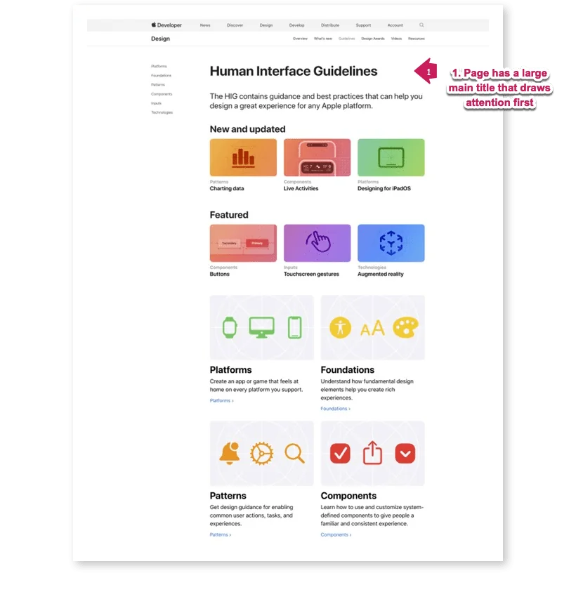
Here’s one example of hierarchy, taken from the Apple Human Interface Guidelines page. As you can see, the name of the page is the largest element on the screen, so there’s no confusion over what this page is about.
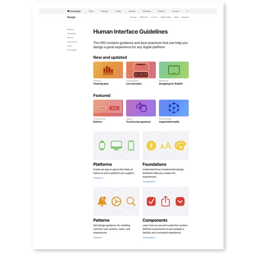
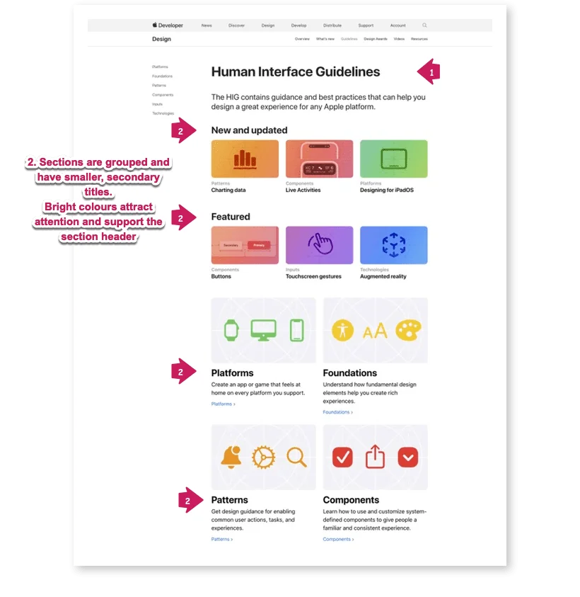
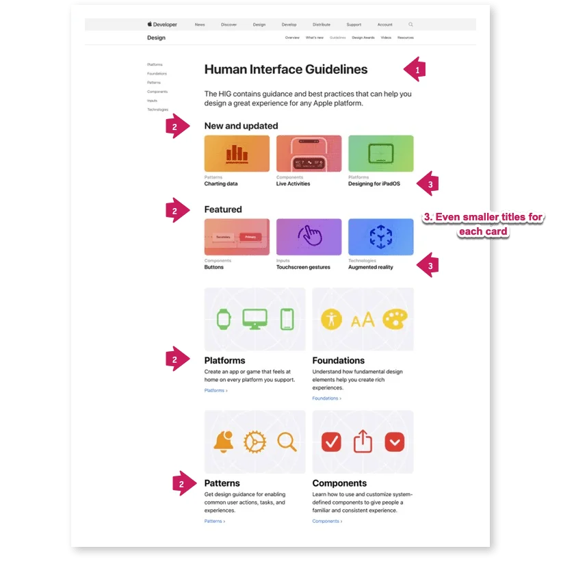
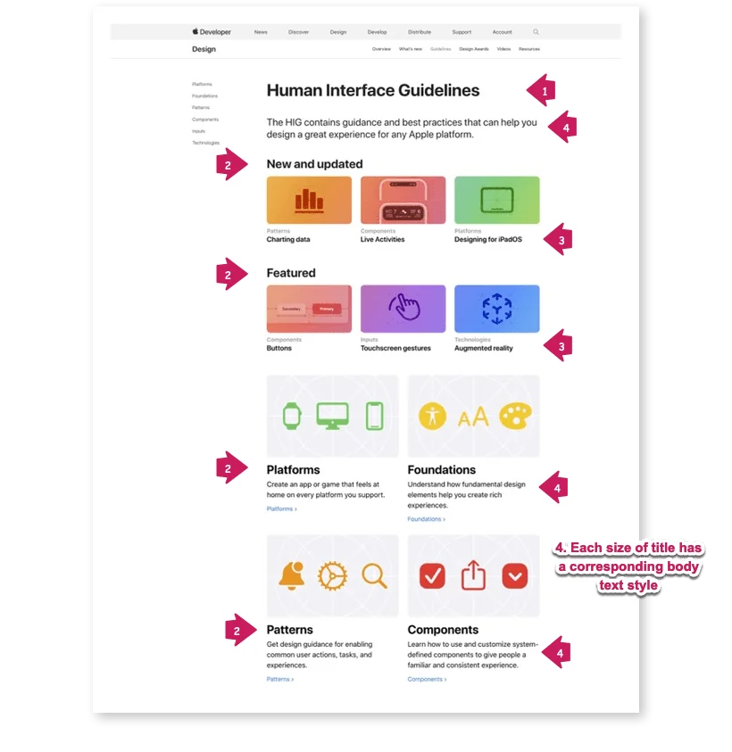
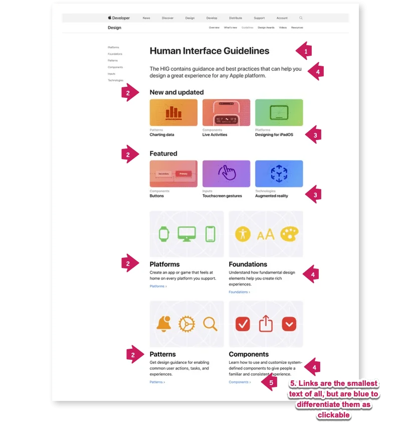
The brightly-coloured sections will probably draw your eye next, and then you’ll likely stop to read what the section titles are. The individual sections below (“Platforms,” “Foundations,” “Patterns,” and “Components”) are larger, but not as saturated with colour. So we can guess that those are still important, but of secondary importance to the “New and Updated” and “Featured” sections.
Here’s an example from Google’s Material Design page.
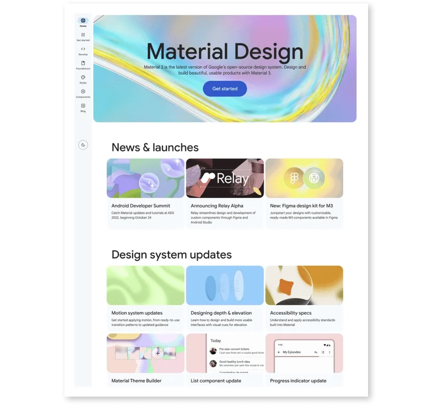
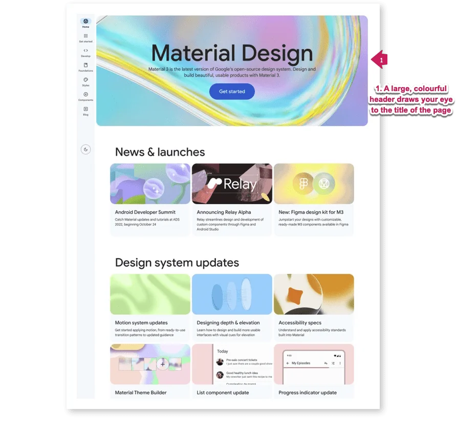
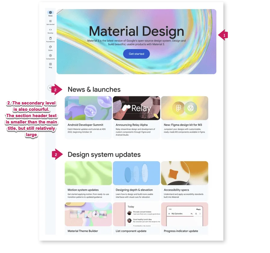
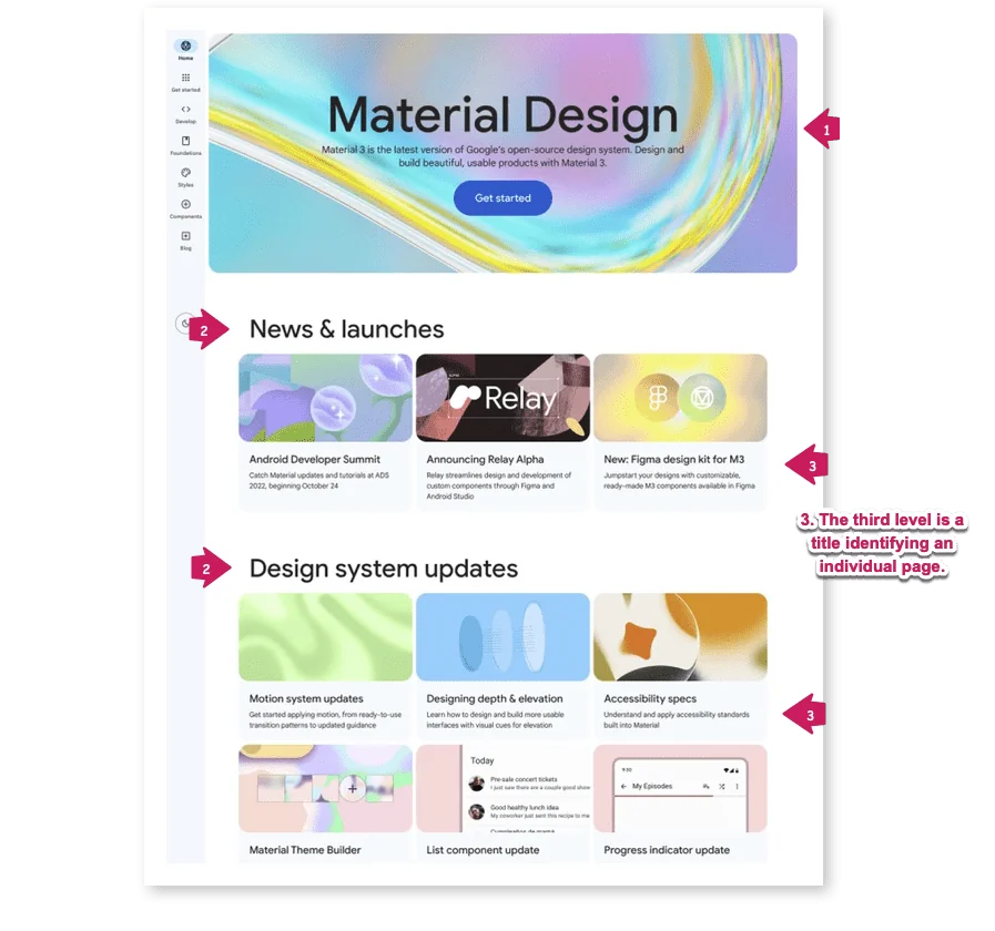
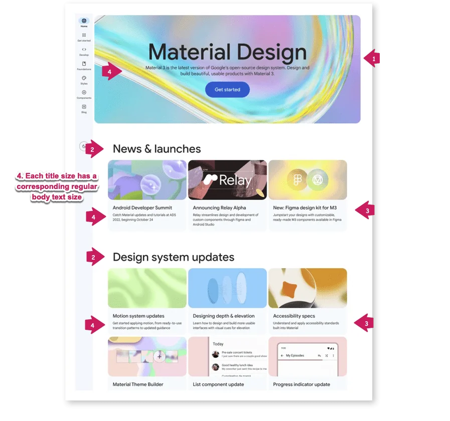
°In the above example, the header is given lots of space, including a very large title, and bright, colourful graphics. Some text directly below the title explains what Material Design is if you’re new to it.
As with the Apple page, you’re likely to read the two subheadings next (“News and launches” and “Design system updates”). Then, you might drop down to read the description of one of the images that might be interesting, followed by reading its description. There are no text links on this page. Instead, the whole section shows a hover effect if you roll over it with your mouse.
It’s interesting that both of these pages, from competing technology companies, have very similar designs. In each case, visual hierarchy helps enhance the UX, by clearly guiding the user through the information and helping them to quickly figure out where to go next.
How do I implement a visual hierarchy?
1. Determine the information hierarchy
First, you’ll need to determine the hierarchy of the data. In many cases, this will be self-evident, since the information will have a natural hierarchy to it. In other cases, there might be different hierarchies you could potentially apply to the same information. (I have a module in my course, The Workflow Design Workshop, that helps you determine your hierarchy in cases where it’s less straightforward.)
2. Highlight the most important information
Once you know how your information is structured, then think about what’s most important in your app. These are the elements you’ll want to emphasize most. Important elements should stand out and attract more attention than other elements. But you have a lot of flexibility here, so don’t be afraid to experiment!
3. Establish your visual cues
The most important thing about visual hierarchy is that there be visible differences between the levels on your UI. So you need to figure out how to do that.
You can clearly differentiate the elements from each other using:
- Size: larger objects (and text), especially higher up on the page, attract more attention than smaller ones.
- Font style: You can contrast bold and all-caps with regular type (and combine this with the type size to create more points of differentiation).
- Colour and contrast: Coloured objects can create contrast and draw the viewer’s eye. Just be careful—don’t overdo the amount of colour!
- Grouping and whitespace: Grouping objects together, and leaving sufficient whitespace around groups and objects can highlight them. This can convey a sense of hierarchy and give structure to the page.
If you want to learn more about visual hierarchy in UX design, I have a lesson in my course specifically on visual hierarchy, breaking down real-life examples.
4. Be consistent
Finally, apply your visual hierarchy consistently. Once you’ve established some rules around your hierarchy, use them whenever possible. This consistency will help users transfer their knowledge of the hierarchy to different screens of your app.
Conclusion
Developing and using a well-defined, clear visual hierarchy is crucial to creating great user experiences. When more important elements stand out, people can more easily understand and navigate your app. They can explore with confidence, and are more likely to describe your app as being simple and intuitive.


