UX Design Workshop Team Training
For companies or teams requesting group training in the UX Design Workshop
"*" indicates required fields
We’ve helped these teams deliver better apps:



This course was the perfect mix of fun and informative, I most certainly got a lot from it. I think it would be beneficial to any developer looking for a fresh approach to problem-solving and ways of designing solutions around your client’s workflows.
—Orlando Pellicano, Data Ops
It doesn’t have to be this way!
You deserve clear, quantifiable requirements that eliminate confusion and indecisiveness, so you can confidently design modern, usable apps that meet your clients’ needs.
I remember what it’s like to anxiously work on a custom software project that delivers one unpleasant surprise after another.
Just when you think you’ve finally got it, the client asks for yet another “small tweak” that they just “forgot” to mention. Well, there goes your estimate (and your weekend)!
But cut to today, and I’ve learned that building a successful app with an amazing user experience is so much more than simply giving clients what they want (actually, they often have no idea what they want—which is part of the problem).
The fact is that the term “UX design” is often misunderstood as only being about how features look on the surface (that’s technically called “UI Design”).
In reality, UX Design is an iterative set of activities that is the very foundation of a custom software project, and has a profound impact on its success.
With over 25 years of experience as a developer and designer, I deeply understand the challenge of creating solutions that delight both users and clients.
I’ve learned the secrets of successful UX design—and therefore, successful FileMaker custom app development and deployment. After working on countless apps over the years, I’ve seen it all!
I’ve also coached dozens of students just like you to learn an effective and efficient UX design process that helps eliminate uncertainty and stress, one which results in gorgeous apps that clients love to use.
Most developers start here
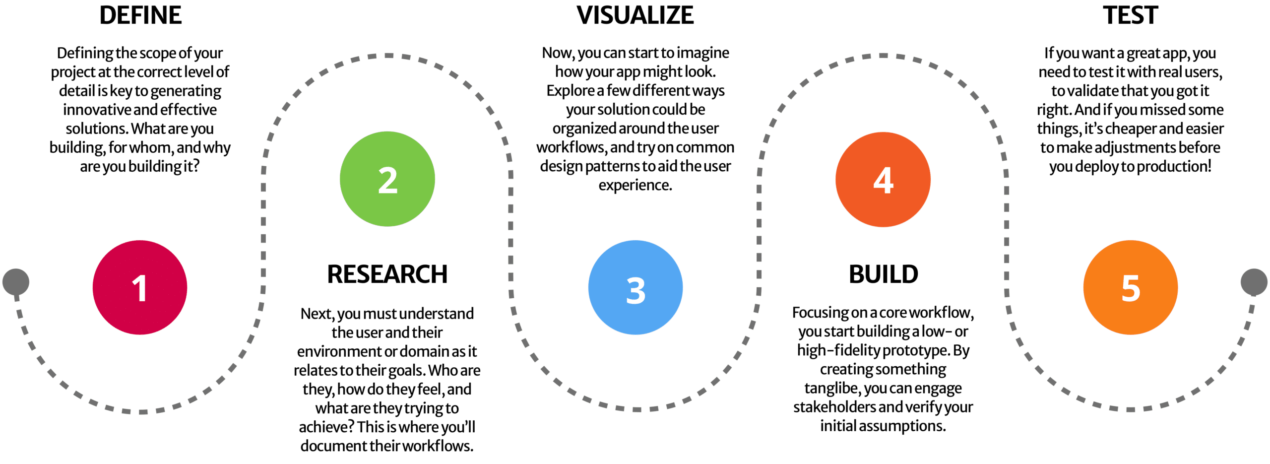
But design really starts here
The Workflow Design Framework is the design process I use to create amazing app designs that my clients love and get tremendous value from.
Following this method ensures that I:
The UX Design Workshop is a UX design course that walks you through the first three (and most important) steps of the 5-Step Workflow Design Framework. These are the parts of the UX design process that are least familiar to most developers—but they’re also the most impactful.

The solid focus on user stories and acceptance criteria deepened my appreciation of the benefits from careful design planning. While we had always paid attention to this area, Alexis raised our understanding and skills to a new level. This leads to better results for clients from the outset.
—JOHN MATHEWSON, KYO LOGIC
Learning about design from Alexis changed the way I ask questions during projects. How the user experiences the system is now as important as every other technical decision. I now strive to make the apps I build to be as easy to learn as a game on your phone.
—SALVATORE COLANGELO, GOYA

Each week of the course, you’ll learn about a different topic.
Then, you’ll practice your skills by completing the homework assignments.
Here’s your roadmap:
This lesson encourages you to shift from a traditional, feature-driven approach to a modern, user-driven approach in software design. This includes focusing on the user’s needs and goals, designing specific tools and interfaces for different roles, and optimizing the UI for reading information rather than data entry. Adopting a user-focused design process dramatically reduces the need for time-consuming changes later in the project.
Good design is not just about aesthetics. It’s about intentionally creating something that helps users easily achieve their goals. This lesson introduces the 5-Step Workflow Design Framework. This structured design process helps you manage your app design project, while progressively reducing uncertainty. Following this framework ensures that you properly define the scope of work before you invest tons of time building something that may or may not address users’ goals.
Nothing wastes more time on an app design project than discovering late in the game that you’re solving the wrong problems. That’s why it’s critical to correctly define the problems you’re trying to solve, and not just treat their symptoms. This lesson shows you how to structure “Just-Right” problem statements that are neither too large, nor too small. It also encourages you to generate lots of potential solutions to problems. That way, you increase your chances of discovering lurking issues before you start investing time in development.
This lesson helps you discover a good data structure for your app. It explores different types of hierarchies, which are the foundation of the user experience. It discusses the importance of aligning the conceptual model with the user’s mental model for an intuitive flow. Next, it covers various types of diagrams you can use to test out different ways your app could be organized, so that you don’t spend precious time building an ineffective structure. Finally, it helps you to determine how to categorize the information in a way that makes sense to the users.
To create modern, usable apps, you need to focus on, understand, and empathize with your users. If you don’t, you risk spending hours of development building a solution that doesn’t meet their needs. This lesson shows you a number of ways to research the people who’ll be interacting with your app, and help you to understand them and their pain points better. It also introduces you to the concepts of User Stories and Acceptance Criteria, which are critical tools that help you keep your project on track. Finally, the lesson shows you an in-depth method of creating user workflows, which is key to effectively communicating your understanding of everything you’ve learned so far—without spending inordinate amounts of time on documentation.
Wireframing is the process of sketching out your app before starting to build it. Wireframes can be hand-drawn sketches, low-fidelity wireframes, or high-fidelity mockups. They are crucial for visualizing the structure and flow of the app, and help you to identify potential problems early on. Creating wireframes (once you know how) is much faster than prototyping directly in FileMaker, and thus can save you a lot of time and headaches. This lesson shows you how to create a low-fidelity wireframe, and walks you through the process of determining your information hierarchy and navigation pattern.
Design patterns are established patterns that solve common user problems and feel intuitive to the user. When apps feel clunky or awkward, it’s often because the design pattern doesn’t effectively match the situation and solve the user’s problem efficiently. This lesson walks you through basic, intermediate, and advanced design patterns that you can use to create appealing interfaces that users can fly through—without spending hours trying to come up with your own solution.
Good visual design improves the user experience, makes an app more appealing, increases users’ trust in you, the developer, and facilitates user adoption. On the contrary, poor visual design can result in a lacklustre user experience and can make it more difficult to get users to adopt the app—even after all your hard work. This lesson details the 9 most impactful visual design principles you need to know to create an appealing UI.
Usability can literally make or break your app. You don’t want to be forced into unnecessary rework because of usability issues encountered at the end of a project. Usability principles are grounded in human psychology, so understanding how people perceive and process information, as well as their memory limitations, habits, and biases, is important to creating an amazing user experience. Learn how to assess the key quality components of usability, so that you can avoid common mistakes that undermine good usability, and create the best user experience possible.

Since taking the course, I look at every FM layout, document, and webpage more critically. I’m also looking very carefully at how I start projects. Instead of diving in, taking the time to analyze the purpose and user in order to make it more welcoming to read and use.
This is just scratching the surface! Every week gave me lots of food for thought!
—BARBARA DALY, UNIVERSITY OF WATERLOO
Through Alexis’ course, our team of developers have learned how to put the User Story front and center in planning and developing features. She also taught us the best techniques to solve difficult User Interface issues in ways that we had never thought about before.
Her course gives developers the tools and the right perspective to solve problems in the best possible way to give the best possible experience and outcome to the end user.
—JUSTIN HESSER, KYO LOGIC

This course has given me the confidence to take on certain challenging new projects that I might have shied away from in the past. Now that I’ve learned a structured design process, I finally feel comfortable taking on more complex UI/UX work, because I know exactly what to do and in what order.
—ROBERT NAUD, ACCOLADE PLUS ACCOLADE
8 weeks of easy-to-follow, step-by-step videos
Inside The UX Design Workshop, you’ll have everything you need to create modern, effective, and usable apps for your clients, while avoiding many of the common pitfalls of app development projects.
But I want to give you the boost you need to really solidify these skills in your mind, enabling you to go forward into the future with confidence. So I’m also giving you a few more resources to help you as you tackle new apps and broaden your skills and experience.
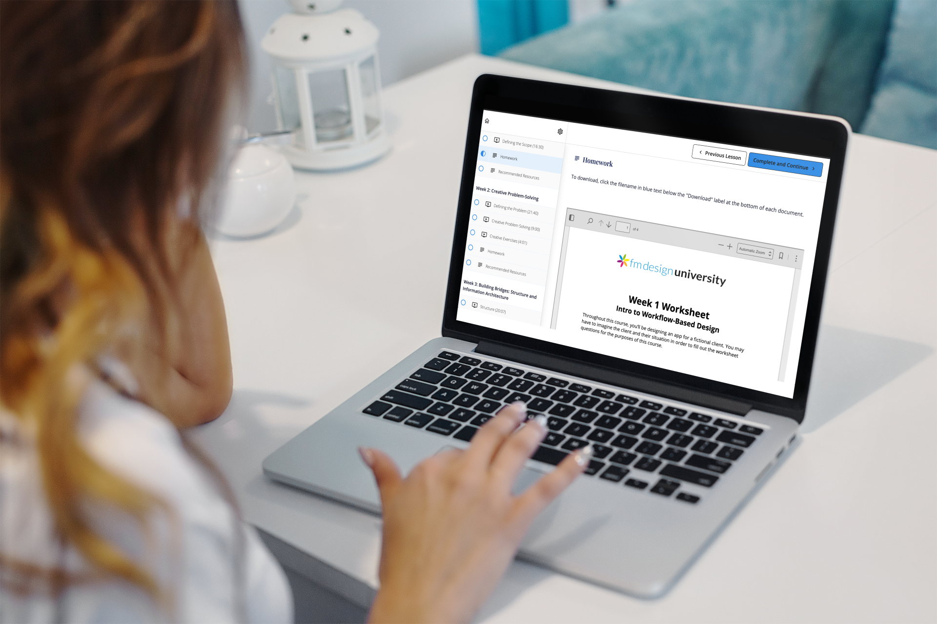
Throughout the course, you’ll apply the week’s lesson to your sample project. Each weekly assignment challenges you to put that week’s lesson into practice and grow your UI/UX design skills quickly.
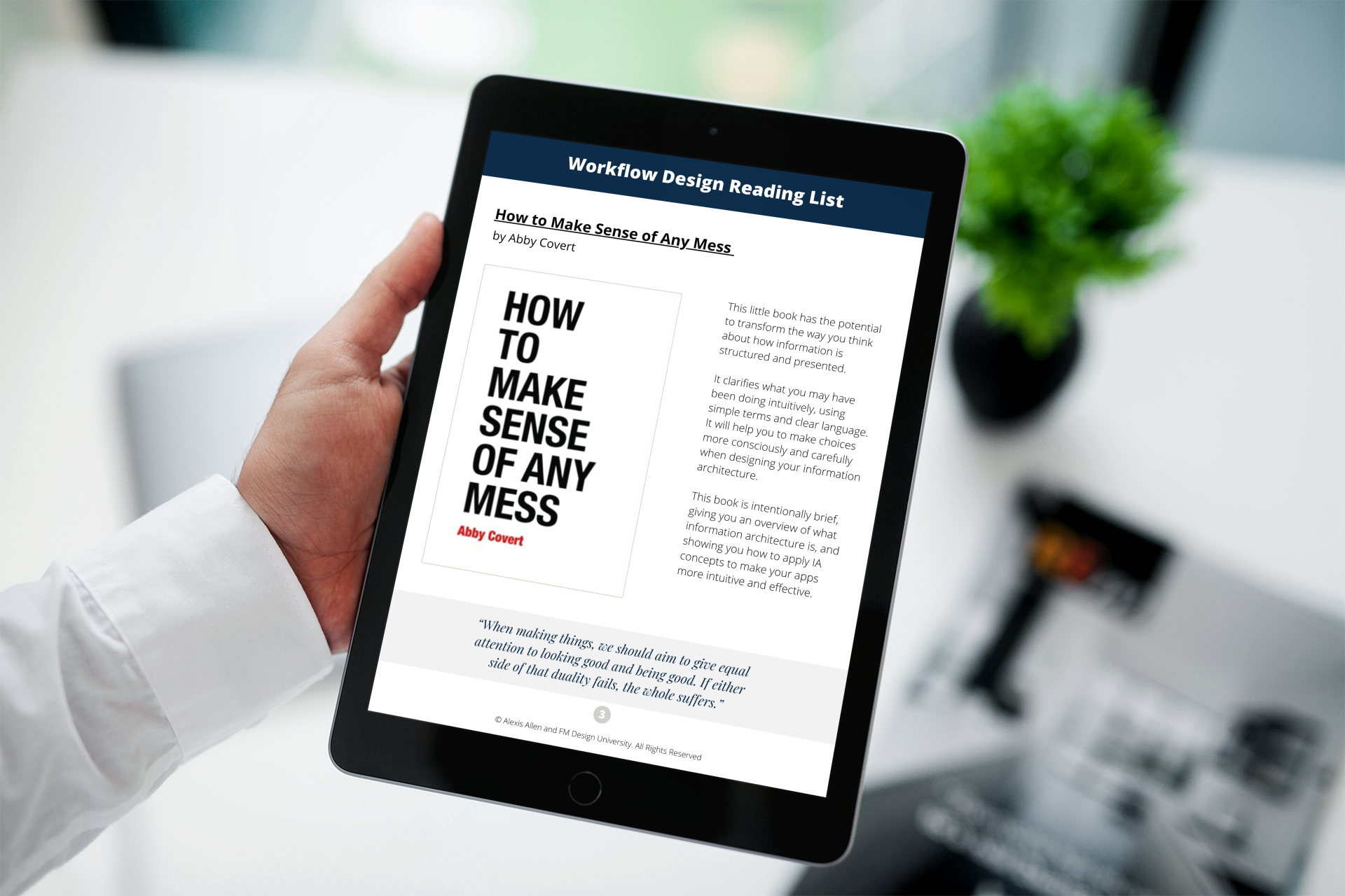
Each lesson comes with a curated set of recommended books, links, and/or articles that provide you with additional helpful information, so you can deepen your understanding as you progress through the course, without reading a million books to find the ones with the most informative content.

The key to creating modern apps that get results is thoroughly understanding your users! But you can quickly get overwhelmed with all the information you collect about them.
The user persona template makes it easy for you to gather all your important user research into one place that’s easy to keep track of and refer to throughout your project.
The heart of Workflow-Based Design is creating effective user workflows. But how exactly do you do that?
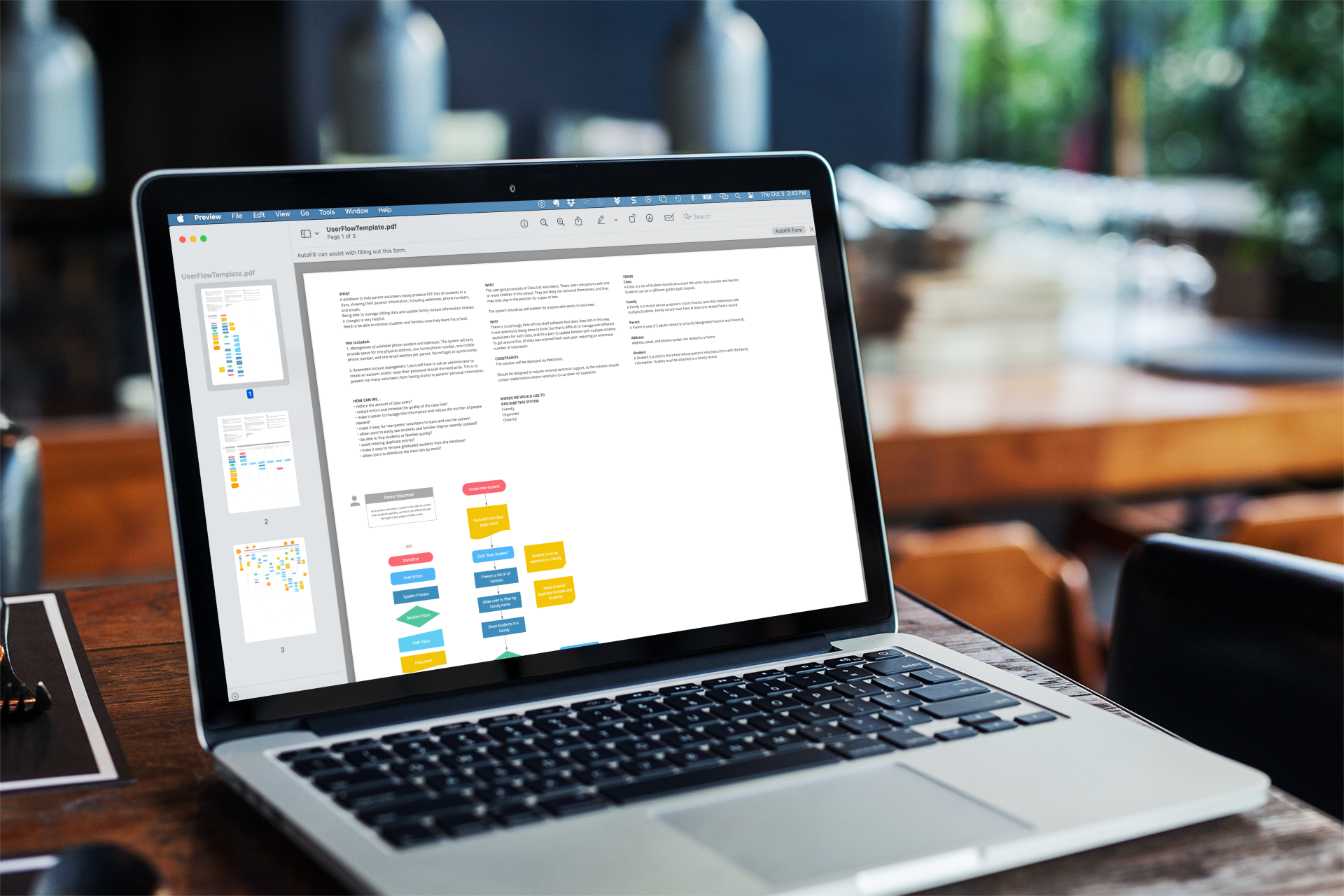
Our exclusive user flowchart template shows you which steps to document in a workflow (and which ones you can safely ignore).
Available as LucidChart or OmniGraffle templates, or use a diagramming app of your choice!
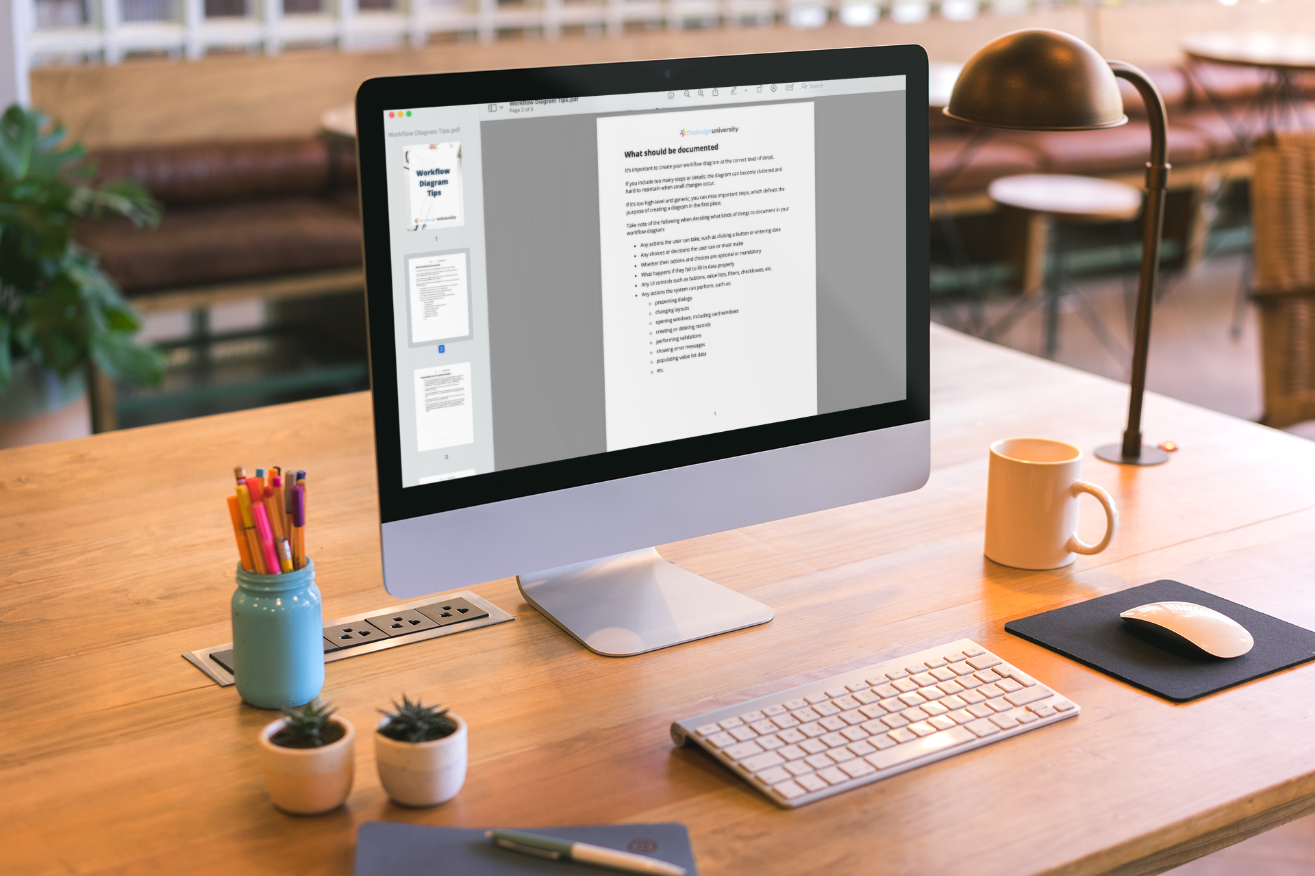
It can be hard to strike the right balance of simplicity and detail when creating a workflow diagram.
Too much detail can make your diagram overly complicated, while too little detail can leave important gaps that could trip you up later and lead to unanticipated revisions.
This downloadable PDF is full of handy tips to help your user workflows rock!
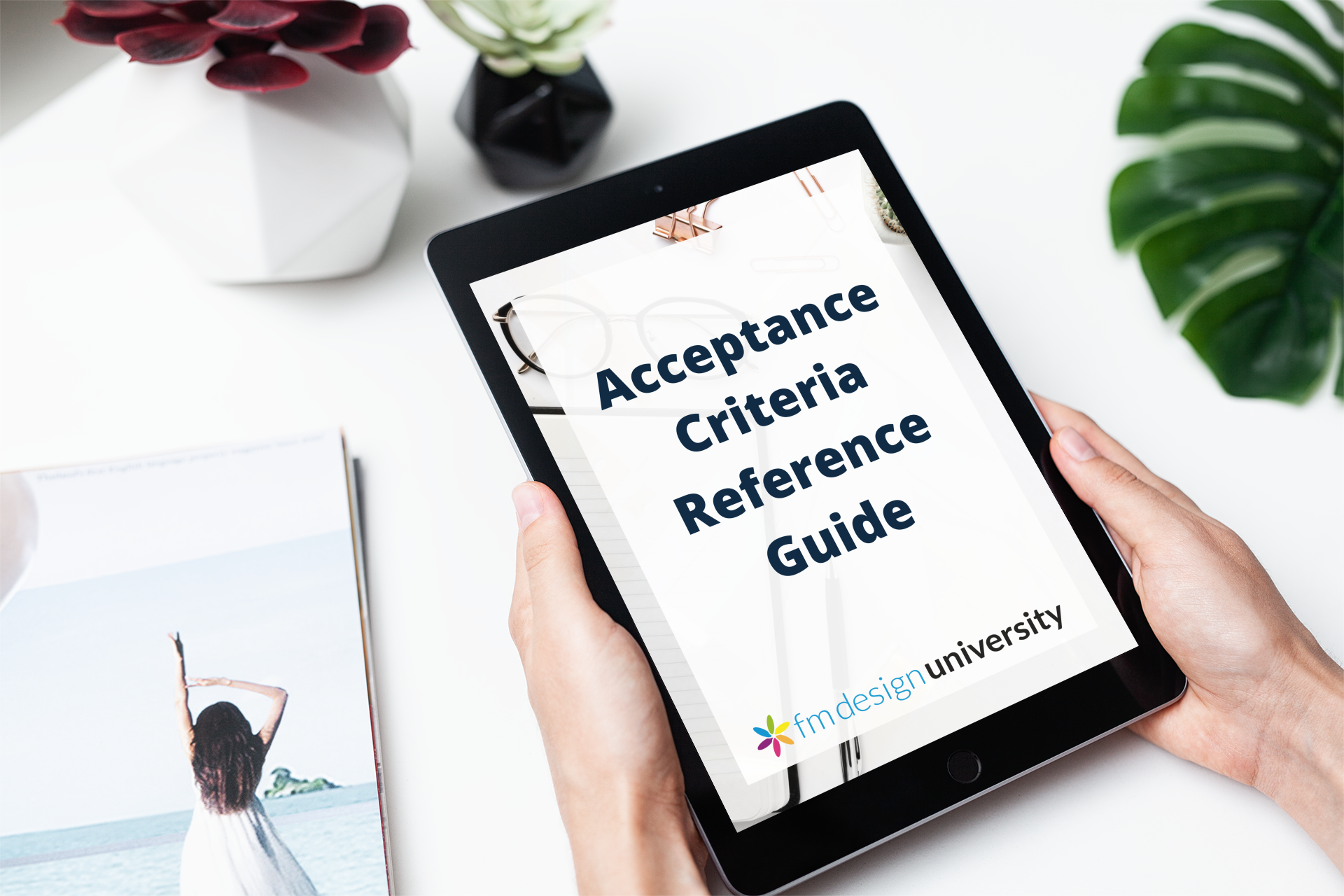
Writing acceptance criteria is essential for ensuring success in your app design project. But if you’ve never written them before, there are some common missteps you might want to avoid.
This downloadable PDF guide is chock-full of the important things to remember when writing acceptance criteria. It also includes some sample acceptance criteria, as well as some examples of what not to do, so that you’ll become a whiz in no time!
You’re going to love this bonus...Have you ever wondered what it’s really like to do design with a client?
In this series of videos, you can look over my shoulder while I design a wireframe live in Balsamiq, sit in on my feedback sessions with a real user in real time, AND watch while I adjust my wireframe based on their feedback.
Some students have said this is their favourite part of the course!
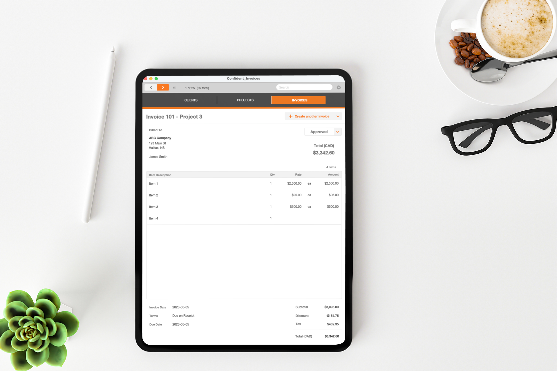
You also get a free copy of The Confident Theme—a fully functional, completely unlocked FileMaker theme file designed by me.
So you can take a peek under the hood and see what a finished product looks like. Steal all my ideas and make them your own—for free!
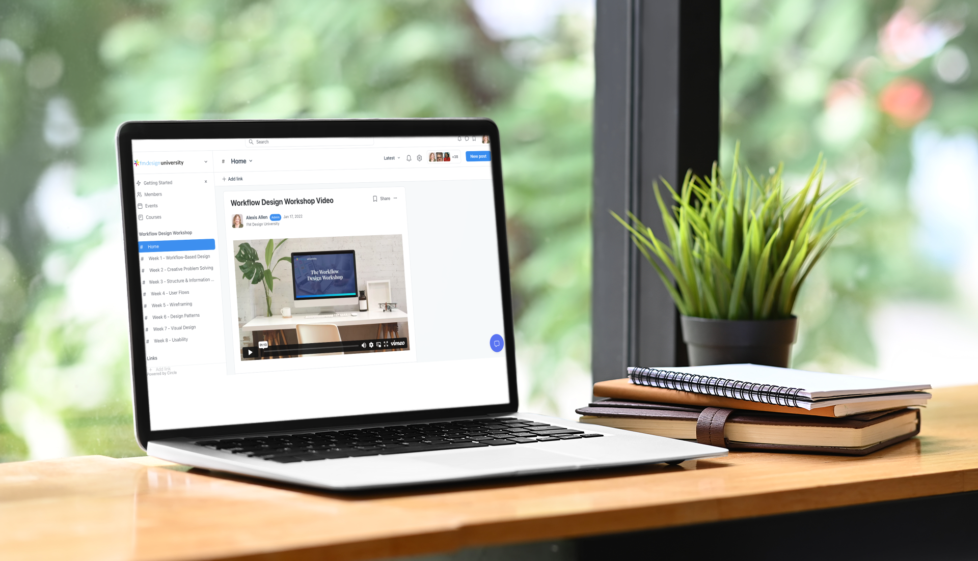
You also have access to the student community, and you can always post there to get personalized feedback from me on your homework assignments, as well as ask any questions you might have.
Everything included in Course, plus:
Currently closed to enrollments
20% - 30% off
Most of my studying for UI/UX designing was just through online resources and YouTube, but there’s no step-by-step process with feedback for my work. I loved how I could design something and get feedback from Alexis right away and correct any mistakes, instead of just reading lectures. This course was a great start to my career in UI/UX design, and gave me the courage to start a portfolio of my work.
Thank you Alexis!
—SHOBBIA RANGANATHAN, DIRECT IMPACT SOLUTIONS
When does the course start and end?”
You can start right now!
Although I recommend going through one module per week, you get full access to the course as soon as you sign up.
And you get lifetime access, so you can come back again in the future if you want to!
What’s the time commitment for this course?”
It depends... on your goals, level of commitment, and how much time you have available.
Each module consists of video lectures and homework. So, it’s a commitment of about 3-4 hours per week at minimum.
However, you could do the course all at once if you really want to!
No matter what you choose, the more time you spend practicing your newfound UX skills, the faster you’ll progress!
How does the course work?”
As soon as you enroll, you’ll be automatically added to the course. You’ll receive an email with instructions on how to access the course.
Once you log in, you can watch the videos when it’s convenient for you. There is homework at the end of each lesson, which I encourage you to complete, as it will give you an opportunity to practice the skills.
Will the course help me create a [specific] app?”
Yes, if you choose.
However, if it’s your first time through the course, I recommend that you work on a sample project (you have a choice of three different ones).
These sample projects are chosen specifically because they’re big enough for you to practice the concepts, but not so large that you get overwhelmed and confused.
That said, once you learn the concepts, you can (and should!) apply the principles to any app of your choice.
Can I try out the course before I buy?”
Yes! You can watch a sample lesson for free.
Just sign up for the Free Preview.
Inside, you can watch the introductory Week 0 video, where I explain what Workflow-Based Design is and why you might want to learn more about it. You can download the course syllabus, and you can see the complete course structure and individual lesson topics.
Is this course only for FileMaker developers?”
First and foremost, the course is about UX design, not about FileMaker specifically.
The references to FileMaker are mostly in the Introduction (Week 0), which you can watch if you sign up for the Free Preview.
The design process is relatively agnostic to the platform you use to develop your app. What could change is the way in which you implement certain features and design patterns based on the capabilities/limitations of the specific platform you choose to use.
Do I need experience with FileMaker before taking the course?”
Ideally, you should have at least some initial experience with database theory and app development.
You may find it difficult to envision your app if you have zero experience with creating apps.
However, you don’t need to have any advanced FileMaker knowledge (or any other platform) to benefit from this course.
The course is focused on helping you build your design skills, not on FileMaker. In the end, you could use this course to design an app for any platform (so long as you take the capabilities and limitations of that platform into account).
How long do I have access to the course?”
You have lifetime access to the course. As long as the course exists, you’ll have full access to it, and can take it again as many times as you like. Many students have gone through the course a couple of times.
You’ll also be able to access any future updates that are made to the course.
English is not my first language. Will I be able to follow the course?”
The course videos are in English. However, subtitles are available in English, French, Italian, Spanish, and German. Homework assignments are currently available in English, French, and Italian.
I’m fluent in English, French, and Italian, and can readily answer questions you may have. The videos themselves are very visual and reasonably easy to follow.
That said, this is honestly only something you can answer, depending on your comfort level. I suggest you sign up for the Free Preview and see if you think it will work for you.

I highly recommend this course as an outstanding learning opportunity. Alexis’ extensive knowledge and enthusiasm for FM design, combined with a thorough curriculum and hands-on experience, made for a truly transformative experience.
She was able to simplify complicated concepts, encourage a collaborative learning environment, and offer personalized guidance, making the course enjoyable and valuable.
The course covered everything from design principles to practical case studies, providing me with the necessary skills and confidence to excel in FM design
—JOE DA SILVA, ARTISAN COMPLETE