Over time, one collects bits and pieces of knowledge about different corners of development. Features that are a little more difficult to discover, or shortcuts that can help out in a pinch. Some of these nuggets can make developing faster, easier, or more accurate. Here are five helpful features you may or may not already know about, but which I’m thankful we have available.
*****************
1. Multiple Inspector palettes
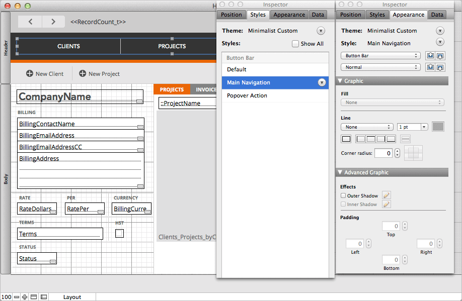
I think we can all agree that the Inspector palette is indispensable. But did you know you can create more than one Inspector window at a time? It’s found in Layout mode under View > New Inspector. I sometimes do this to cut down on the amount of switching between tabs when creating styles, for instance. You can keep one Inspector on the Appearance tab so you can modify fill, line and other attributes, and the other on the Styles tab, to easily manage and create styles as you go. There are also lots of other situations where having multiple Inspectors is useful. You can even make one of them quite small and tuck it away in a corner. If you find yourself switching panels in the Inspector a lot, it might be easier to open a new Inspector instead.
2. Change measurement units
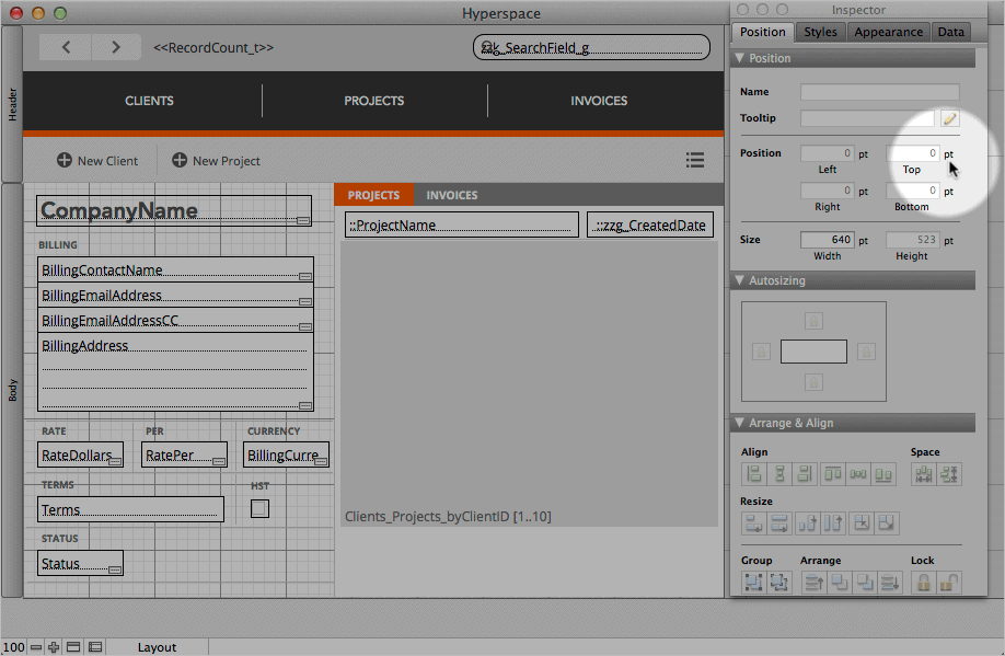
Let’s stay with the Inspector for a moment. Have you been stuck designing in inches because you didn’t know you could change the measurement units? You can change them by clicking on the unit label in the Position area. I’m not sure who showed this to me, and I’ve known this forever, but it’s not necessarily obvious to everyone. I often change units when switching between designing interfaces (where I generally use points), and designing reports (where I sometimes use inches or centimetres to measure printed pages).
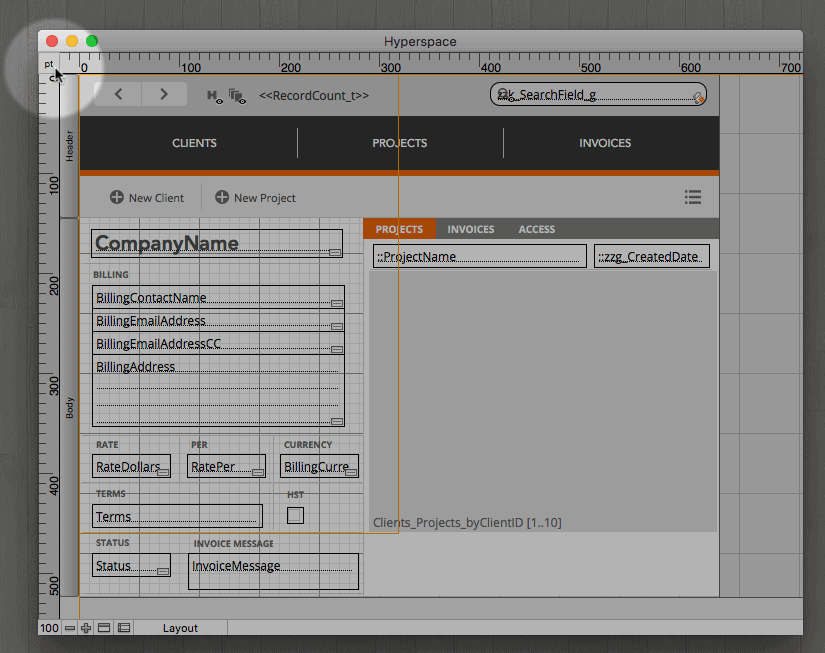
The other way to change units is to show the Ruler ( View > Rulers) and click on the units at the origin.
3. Shorten merge fields using Position
When you place a merge field on a layout, the length of the field name (including any relationship) determines the space it takes up on the layout. However, in some cases the data it is intended to contain is quite a lot shorter. I sometimes have long relationship names, so this can be an issue. If you simply try and drag the handle to make it shorter, the text wraps to the next line, possibly throwing off the baseline alignment or encroaching on nearby objects such as portal rows or tab panels.
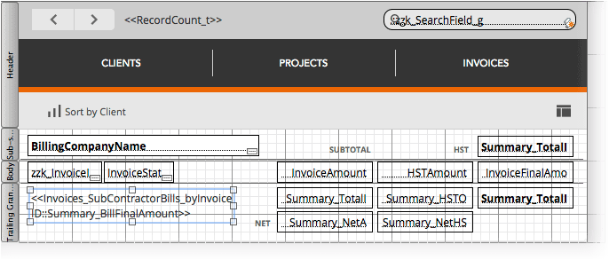
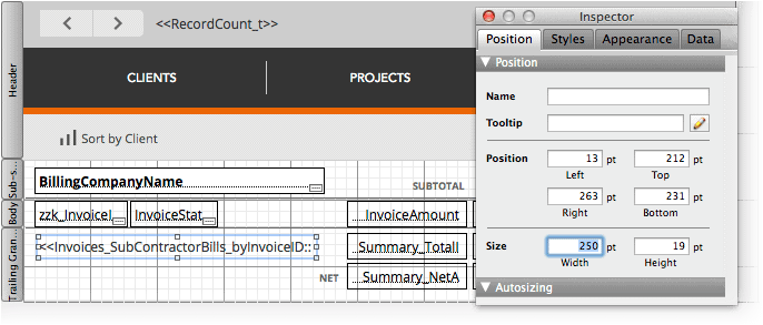
However, you can shorten a merge field using the Position area of the Inspector. Simply type in the desired width, and—ta-da! A short merge field, no matter how long its name happens to be.
4. Show Sample Data
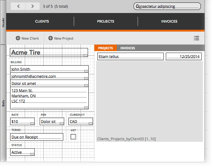
Sometimes you want to see how record data will look while you’re still designing in Layout mode. Rather than switching back and forth between Layout and Browse, there is an option to show data from your records in Layout mode (View > Show > Sample Data). This will show you data in Layout mode from the record you’re on in Browse mode. If there is no data to show, then the fields are filled with lorem ipsum text. You might want to navigate to a record that has lots of text first in order to see how it will look as you adjust field lengths and so on. It’s a useful little feature that I sometimes forget about, but does come in handy from time to time.
5. Hiding/showing sub summary parts on a single layout
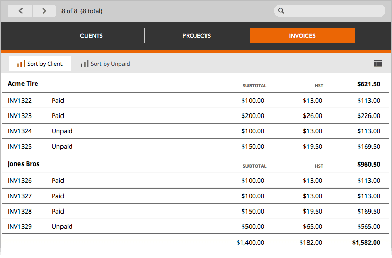
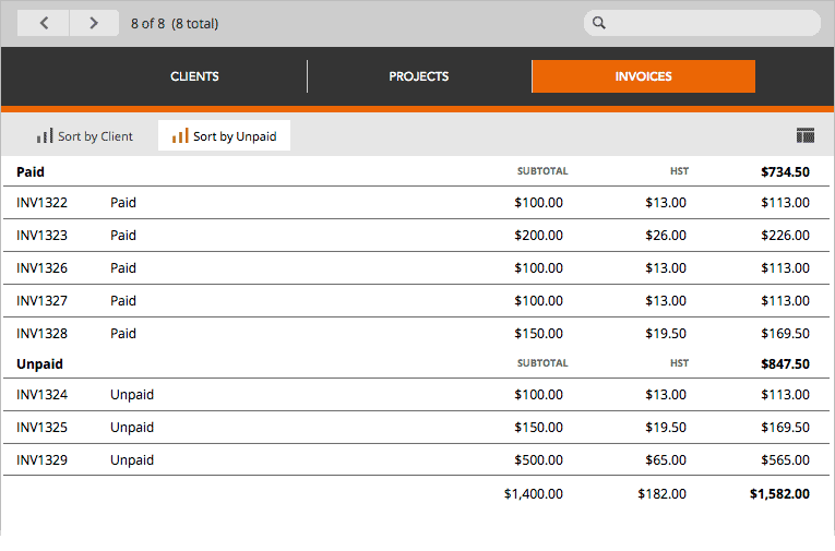
Like that super-cool minimalist coffee table that opens up to reveal a personal lap pool underneath (just kidding!), interface elements that do double duty are always welcome. Here, we can take advantage of the fact that sub-summary parts on a layout only show when the data is sorted. That means we can have as many sub-summary parts as we want, and they will only show if the user sorts the data. So one layout can have multiple purposes, cutting down on overhead.
Conclusion
I hope you found one or two useful things here to help you solve a problem or make your development a bit easier. If you have any favourite hidden features that you’d like to share with everyone, please leave a comment below!


Love this! I didn’t know you could do that with merge fields, so I’m passing this on to my little user group. Thanks!
Thanks Keena!
I didn’t know you could do that with merge fields either. The first character of the merge field has, as long as I can remember, determined the size and styling of the merge field. All other characters can be selected and resized to 1pt and then the merge field can be made much smaller.
Your method has the benefit of being able to tell at least part of the merge field’s name (depending on how small you make the merge field’s width). I’ve had to copy the merge field, make all the text, say 9pt, to read the merge field’s name.
Wow, I didn’t know that about the merge field sizing either. Very handy and simple. There is a problem if you double click the merge object, it will resize itself again and get bigger. So you have to keep yourself from doing that (or use the position palette to fix it again).
I also use merge sizing but it easily expand as Bruce says. This behavior is annoying and we even don’t want to be re-adjusted its size by *name*. Why don’t we request to FMI?
For sure! Though I won’t be holding my breath about it…. 🙂
Thanks for the tips. I’ve always know about changing units by clicking the origin of the rulers, but never realized you could do it in the inspector. And thanks for the merge field size tip! I’ve been wondering how they created the starter solution layouts with smaller merge fields like this, because once I would alter or double-click them, I couldn’t seem to get them back. Even asked around at DevCon and couldn’t get an answer! Now I can sleep at night. ;^)
Excellent tips! Regarding the merge field #3, do you mean Height instead of Width? I can’t get it working with Width.
I’m not sure what the problem might be, Width works for me.
The resizing merge fields via position is a new one for me. Thanks Alexis.
Thanks for sharing that merge field tip. I wish I had found all of your tips when I first started. I’m sure it will be a nice revelation to beginning developers.
Thanks for the tips Alexis. Always useful to see what other developers have discovered. Love the tip about the merge fields. And hadn’t thought about the advantages of having two inspectors up at a time. I’ll check that out.
Thanks James!
Love your top 5! You’ve checked off my box for ‘learning something new’.
Great! Thanks!
You can also overlay a button on a subsummary part. When the user clicks on the subsummary part, a script can Find based on the current content of that sort field.
Thanks for the tips!
Merge fields can also be placed into button bar segment labels, so that the space is the space of the segment, regardless of the length of the calculation